Links vs. buttons
One of the most common accessibility fails.
Please, do not code and style a div or a span to look and act like a button or link.
Building accessible interfaces with semantic HTML
One of the most common accessibility fails.
Please, do not code and style a div or a span to look and act like a button or link.
Go somewhere - another page, another place on the same page, another view, another component.
Do something - open a modal, submit a form, toggle an accordion, etc.
Native HTML elements come with keyboard support, focus styling, roles, states, and behaviors.
Fake elements require you to re-create all of that manually, and often poorly in comparison.
Native elements are flexible and can be styled with CSS.
                  .fake-button {
                    display: inline-block;
                    padding: 0.5rem 1rem;
                    background-color: #007BFF;
                    color: white;
                    border: none;
                    border-radius: 4px;
                    text-align: center;
                    cursor: pointer;
                    user-select: none;
                  }

                  .fake-button:focus {
                    outline: 2px solid #0056b3;
                    outline-offset: 2px;
                  }

                  .fake-button:active {
                    background-color: #0056b3;
                  }
              function handleClick(event) {
                alert('Button clicked!');
              }

              function handleKeydown(event) {
                if (event.key === 'Enter' || event.key === ' ') {
                  event.preventDefault(); // Prevent spacebar scrolling
                  handleClick(event);
                }
              }
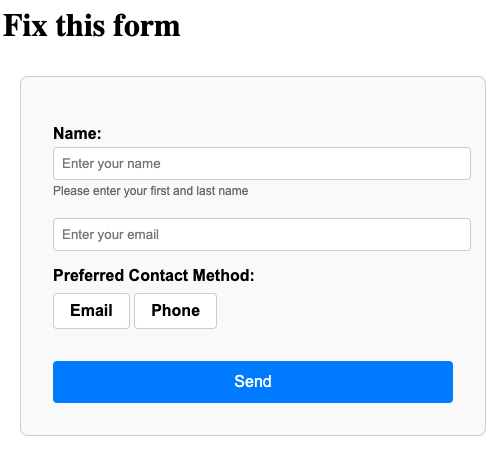
button elements.Missing form fields impact users with cognitive disabilities and low vision users, not just screen reader users.
Don't use a placeholder as a label substitute.
Label is connected to the form field with a for attribute that references the id attribute of the form field:
label has a for="name".
input has id="name".
Input is wrapped inside the label element, so no for or id needed.
<form>, <select>, <textarea>, and <input> elements (as long as the input type takes input.id and/or name attribute, and be a descendant of a <form> with a submit button.required attribute to form fields that are required for submission.Pair with a label that clearly marks the field as required.
Username must be 6–20 characters and contain only letters and numbers.
Key takeaways: